The new thethings.iO design & experience
As entrepreneur Jim Rohn once said: “Things do not get better by chance, they get better by change.” This is especially true in the world of technology, where nothing stays the same for long. Today, developers, entrepreneurs and innovators are constantly pushing the boundaries of what is possible to give the world better and faster technology. So here at thethings.iO we think change is a good thing; and in this case change is a very, very good thing.
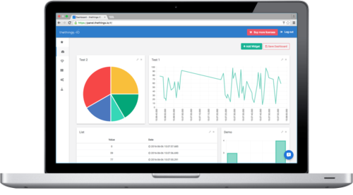
Enter the new thethings.iO IoT platform design! We’ve changed around the look, feel and user experience of our panel to give users the most optimal experience for connecting and managing their products. The new panel employs Material Design concepts like minimalism, lighting, shadows and bold colors to create a thethings.iO experience that is both simpler and more sleek. The “pen and paper feel” makes it easier to navigate and the flat design is a lighter, more modern twist on the old panel.

We also improved our side navigation bar, making it smaller and fixed. It contains identifiable icons that make it simple to move back and forth between your Things, Apps, Cloud Code and more. A smaller side bar also means you have more space available for what really matters: your things and your data. This design, in all, creates a larger viewing panel in every section of thethings.iO. This is especially useful in the dashboard, where your widgets are now bigger and easier to read.

If our new look isn’t enough to spark your excitement, we’ve also optimized the platform. It now runs faster than ever so you can access the data from your devices wherever you need to, whenever you need to. So head on over to the most amazing IoT platform now and start connecting all your things to the Internet.

